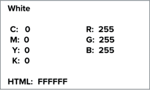
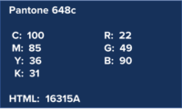
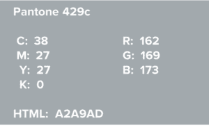
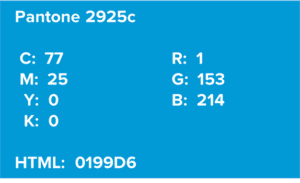
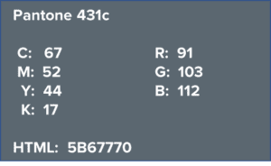
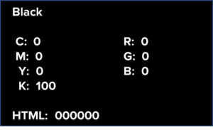
The following are BRTC’s branding marks. Please use as identified below. All uses of BRTC logos must meet the guidelines administered internally or externally.
Restrictions
Please do not do the following. These guidelines refer to the BRTC logos, the mascot logo, and the BRTC seal.
- Use unofficial colors
- Squeeze or stretch the logo. Always scale proportionally.
- Overprint on top of the logo (Ex. do not write ‘Go Black Hawks’ over the institutional logo).
- Use the waves or “BRTC” lettering alone unless given permission by the Office of Institutional Advancement
- Use mascot or institutional logos as the background of the image unless given permission by the Office of Institutional Advancement
- Make any changes to the logo
- Crop the logo
- Rotate the logo
- Use more than one BRTC logo at one time
Help With Branding
If you have any questions or requests about the logo, contact media@blackrivertech.edu or call (870) 248-4026.
If the logo is pixelated–looks blurry, fuzzy, or generally unclear–please contact us and we will help!
To Download an Image or Logo
- Right-click on the image below
- Click Save image as…
- Identify a location on your computer
- Click Save

Primary Logos
BRTC Colors
Due to the differences across applications and paper, there will always be slight discrepancies when using Pantone Matching System (PMS), CMYK or RGB colors.
- The PMS palette is the college’s preferred printing palette and should be used for printing where possible.
- The CMYK palette should be used for printing when the circumstances do not allow for PMS.
- When using the CMYK palette, a proof must be approved through IA before printing.
- The RGB palette should be used for all screen-based applications.
Fonts
- The official BRTC header font is Montserrat, downloadable from Google.
- BRTC's official text/body font is Garamond. It is a standard serif font on most word processors and is available from Adobe.
- Here are instructions for downloading fonts to your computer.
BRTC Logos
Mascot and Word Mark Logos
Foundation Logos
For More Information

B.A., M.A., English, Arkansas State University; Ed.D., Adult and Lifelong Learning, University of Arkansas

Liebhaber, Dr. Karen Powers

Owens, Emily


